Design Principles/Task 1
28.8.2020 - 4.10.2020 (Week 1-6)
Nur Allyssa Nabilah Binti Mohd Nizam / 0337796 / BDCM
Design Principles
Task 1 (Exercises)
Design Principles
Task 1 (Exercises)
LECTURE
Week 1: Contrast & GestaltFor the first week of classes, I met my lecturer Ms Jinchi. She briefed us on our MIB (Module Information Booklet). She then continued by showing us lecture slides which she first explained about the Elements of Design which are:
- Dot
- Line
- Shape
- Colour
- Value
- Texture
She then continued explaining the Principles of Design which are:
- Balance
- Emphasis (Contrast)
- Repetition
- Movement (Pattern, Rhythm)
- Harmony
- Unity
Week 2: Emphasis & Balance
Week 3: Repetition & Movement
Week 4: Harmony & Unity
Week 5: Symbols & Image and Words
INSTRUCTIONS
For our first task, we were assigned to create a design for contrast and gestalt with only the use of black and white paper
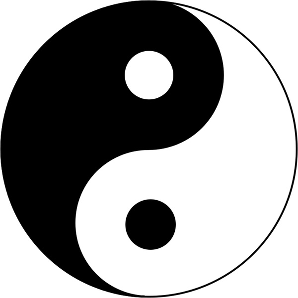
Contrast
Before starting out on my design I decided to have research about the contrast in the aspect of design.
The contrast in the aspect of design refers to differences in values, colours, textures, shapes, and other elements.


The pictures above show the use of contrast
After completing my research I started searching up ideas on both google images and Pinterest for some ideas to create my own design. After searching up some designs this where it took me

After browsing through the tab this very picture caught my eye. The moment I saw it I immediately thought of the movie Kung Fu Panda which then sparked an idea, I took out my sketch paper and straight away started drawing out sketches of my design.
After hours of sketching, I was able to come up with 2 designs that I really feel satisfied with


Figure 1.1 Contrast Design Sketches
After looking over the designs again I decided to go with my first idea which then I opened them up to my Adobe Illustrator and started drawing it out into my computer which then gave me this output.

Figure 1.2 Digitalized design
Gestalt Theory
Gestalt principles or laws are rules that describe how the human eye perceives visual elements. These principles aim to show how complex scenes can be reduced to more simple shapes. They also aim to explain how the eyes perceive the shapes as a single, united form rather than the separate simpler elements involved
Based on the principles of Gestalt I decided to apply the Principle of Continuity. When I looked further into the meaning of the aspect continuity I taught of perspective art which then I started doing my research to get some ideas for my design.

After browsing through the variety of images I've decided on these 2 sketches


Figure 2.1 Sketches
As for my first idea I came up with it by being inspired by my favourite Studio Ghibli movie Spirited Away. As for my second idea, I thought about as I was going home from campus taking the LRT


After many hours of picking, I decided to go with my second idea because I feel that the first one was a little bit too complicated for me to design.

Figure 2.2 Digitalized Design
After the process of cutting and pasting to make my design come to life here is the final product


Figure 3.1 Final Product
Exercise 2: Emphasis & Balance
For our next task, we were assigned to create a design for emphasis and balance with the use of coloured pencils and a coloured marker
Emphasis
Before starting out on my design I decided to have a research about emphasis.
The emphasis in the aspect of design refers to a strategy that aims to draw the viewer's attention to a specific design element
/Getty_Emphasis-167532036-56afa5cc3df78cf772c714d1.jpg)

After completing my research I started searching up ideas on both google images and Pinterest for some ideas to create my own design. After a few hours of searching, I decided to take a break and decided to watch some kpop music videos, then I completed watching a music video named Wayo by Yedam a member of a group named Treasure at the end of the video a logo popped up before the video ended.

After looking at this logo I decided to go with this logo but adding a little touch of my own design.
I started up by opening my Adobe Illustrator and started drawing it out.

Figure 4.1 First emphasis design
After some feedback from Ms Jinchi, I retouched it and played around with the colours, and ended up with these 2 ideas.

Figure 4.2 Retouched emphasis
After given another feedback from Ms Jinchi, she mentioned that the shapes look way better but I just have to play around with the colour combinations for the shapes
Balance
It's defined as the distribution of visual weight in a work of design. It is the visual equilibrium of the elements that cause the total image to appear balanced. It can be categorized into two types symmetrical and asymmetrical


After I've done my research the moment I saw symmetrical I immediately thought of butterflies because they have wings that both are equally the same size to each other. I immediately opened my Adobe Illustrator to come up with a design.

Figure 5.1 First balance idea
After showing it to Ms Jinchi she mentioned that it could look better and that I should give some space around the butterfly as well as the design on the butterfly so then I decided to do some search on the butterfly wings designs

After looking up some designs I ended up with this design which yet Ms Jinchi told me that I could do even better

Figure 5.2 Readjusted butterfly sketch
After getting feedback from Ms Jinchi for my latest design I started retouching and readjusting both my artwork for Emphasis and Balance which my final designs are


Figure 6.1 Design choices
Finally after choosing the designs I like I worked on my final product and here are the results


Figure 6.2 Final Design Product
For the next task, we are required to create designs for Repetition and Movement with the use of Oil Pastels or Water Colours.
Repetition
Repetition is simply repeating a single element many times in a design. For example, you could draw a line horizontally and then draw several others next to it. We can also use shapes, colours, textures, fonts, and more to maintain this consistency via repetition


After completing my research on the topic I started looking through Pinterest and Google Images to get some ideas which are the sketches I've ended up drawing out.


Figure 7.1 Repetition Sketches
After looking over my designs Ms Jinchi really liked my first sketch idea and told me to enhance more of it.

Figure 7.2 Chosen Repetition Sketch
After I was given the feedback on my repetition sketch and Ms Jinchi helped me choose my final design which then I started working on a better version of my design

Figure 7.3 Enhanced Repetition Sketch
Movement
Movement is the path the viewer's eye takes through the work of art, often to focal areas. Such movement can be directed along lines, edges, shape, and colour within the work of art


After completing my research on the topic I started looking through Pinterest and Google Images to get some ideas which are the sketches I've ended up drawing out.


Figure 8.1 Movement Sketches
After Ms Jinchi looked over my sketches she really liked my first sketch she asked me to enhance more of it and told me to use it as my final design

Figure 8.2 Chosen Movement Sketch

Figure 8.3 Enhanced Movement Sketch
Finally, after redrawing out both my Repetition and Movement sketches, I decided to use Oil Pastels to colour my artwork which then gave me my final design.


Figure 9 Final Design Repetition and Movement
Exercise 4: Unity & Harmony
For this weeks task, we are required to create designs for the design principle Unity and Harmony
Unity
Design theory describes unity as how the different elements of a composition interact with one another. A unified layout is one that works as a whole rather than being identified as separate pieces

After doing some research on unity I decided to sketch out an idea based on my understanding of unity. The idea behind the sketch is the meaning of the word unity itself which is being together or at one with someone or something.

Figure 10.1 First Unity Sketch
As Ms Jinchi was looking over other peoples sketches and giving them feedback, I got a better understanding of unity in the principles of design and decided to sketch out another drawing during class

Figure 10.2 Second unity sketch idea
Harmony
Harmony in art and design is the visually satisfying effect of combining similar, related elements. For instance adjacent colours on the colour wheel, similar shapes, and many more

After looking into what Harmony means I decided to sketch out my understanding of Harmony. The inspiration behind this idea is that when I think of harmony I think about musical notes hence the sketch I made of the musical notes.

Figure 11.1 First sketch harmony
While Ms Jinchi was looking over other people's designs I was able to understand better as to what the design principle harmony means which then I decided to look into the principle more and sketch another idea. After looking into it more I was able to come up with a better idea as a comparison to my first idea. The idea behind this sketch is that as we all see its buildings are made of different shapes and sizes even though they are made of different shapes and sizes the buildings just blend in well together.

Figure 11.2 Second sketch idea harmony
After getting feedback from Ms Jinchi I decided to stick to my second sketch idea and make it look better and fit in for the design principle Harmony which I feel quite happy as to how it turned out.

Figure 11.3 Harmony sketch idea
After finally choosing my designs for both Unity and Harmony, I started painting my design.


Figure 12 Final Design Unity and Harmony
Exercise 5: Symbols & Image and Words
For this task, we are required to create a design for Symbols as well as Image and Words
Symbols
In the lecture video, Ms Jinchi covered many types of symbols such as pictorial symbols and abstract symbols but for this exercise, we are required to create Arbitrary symbols. Arbitrary symbols are symbols that refer to something but yet do not refer to it visually.


After looking into what exactly is Arbitrary Symbols I started sketching out some ideas that I thought could be Arbitrary Symbols.

Figure 13.1 Arbitrary Symbols sketch ideas
As for my first idea and second idea I thought of drawing out the phrases "With Flying Colours" and "Face The Music" while my third idea was inspired while I was listening to one of my favourite band's songs called Safety Pin. Finally, as for my final idea, I was inspired by the love bridge where couples would look the padlocks onto the bridge to symbolize how strong their love for each other.
After I was given some feedback by Ms Jinchi I realized that I still didn't have a proper understanding of what exactly Arbitrary Symbols are so after long hours of thinking I was able to come up with an idea which I'm quite satisfied with.

Figure 13.2 Final Arbitrary Symbol Design
The meaning behind the symbol that I've created is that we all start off in the darkness which hence represents the colour black which later on we slowly start to progress and start to get the hang of things which we start coming into the light which represents the colour slowly turning lighter but not all first attempts are a success at some point in life we all will slowly drop and start to fall which we then have to rebegin from the darkness we were in and soon enough after amounts of effort that has been put out we will finally reach our life goal which represents the ball of a rainbow.
Image and Words
In the lecture video, Ms Jinchi talked about the use of Image and Words (Typography) in Design. She asked us to create a collage which uses images and a few words. I went ahead and started sketching out ideas that I could use as a collage.
Figure 14.1 Collage Sketch Idea
The idea behind the first sketch was to show the daily routine of the girl in the morning and at night.
As for my second sketch idea, I decided to sketch out a collage representing what goes on in a girls mind and what they really want.
After thinking through which idea I liked I decided on my second sketch idea and went straight to work. Since I didn't have many magazines I decided to print out some elements that I needed and include them in the collage which I finally came up with this collage work which I felt quite satisfied with it.

Figure 14.2 Final Collage piece
FEEDBACK
Week 1General Feedback:
Ms Jinchi looked through my designs for contrast and gestalt
Specific Feedback:
As for my Contrast Design, she mentioned that it had a great concept just that I needed to touch up and add in a few more details into my design. As for my Gestalt Design, I have gotten the idea of applying the principle of my choice (Continuity) just that I made an endpoint which I need to improve on for the design
Week 2
General Feedback:
Ms Jinchi looked into my emphasis and contrast designs
Specific Feedback:
As for my Emphasis Design, she mentioned that my design was okay just that the shape and colour should be adjusted. As for my Balance Design, she said my picture is too zoomed in that the picture could have some space, as well as my butterfly wing design, should be improved
Week 3
General Feedback:
Ms Jinchi looked into my repetition and movement designs.
Specific Feedback:
As for my Repetition Design, she mentioned that the design was okay just that I have to be improved and play around with the colours. As for my Movement Design, she liked the concept of my idea just that it must be edited as well.
Week 4
General Feedback:
Ms Jinchi looked into my unity and harmony designs
Specific Feedback:
As for my Unity Design, she liked the idea just that the design could be done in a portrait from and play around with colours to create a united look. As for my Harmony Design, she said that I understood the concept just that it still needs to be retouched.
Week 5
General Feedback:
Ms Jinchi looked into my symbols designs
Specific Feedback:
For my Symbol Design, she said that it's still not an Arbitrary Symbol because the symbols are quite clear as to what it represents and I still need to have more exploration.
REFLECTION
Experience:
After meeting Ms Jinchi for the first time, I found that she was a really nice lecturer to me knowing that I didn't have a background in designing she encouraged me and made sure if I needed to help to always get back to her if I needed any help. Even after I showed her my design that is not so great for task 2 Ms Jinchi still said that it has a positive side for the designs I made. Ms Jinchi is quite happy that I was able to draw out even more ideas as compared to my 2 previous tasks.
Observation:
After meeting Ms Jinchi both online and face to face, I realized that I prefer to have a face to face class with her because it is an easier to communicate with her and show the designs I've done. I realized for this week I got really bored very easily since it was online.
Findings:
After doing task 1, I found that it was really hard to create an original design because of how much designs are already out there for our topic Contrast and Gestalt but after much researching and browsing on Pinterest, I was able to come up with my own design. For task 2, I realize that coming up with designs were slightly easier because the principles that I have to apply are applied in my favourite shows and music video. For task 3, I found out that inspiration can come from daily objects and objects around you. For task 4, it took me a while to understand and come up with ideas for Harmony and Unity. For task 5, it took me a while to understand what exactly I'm supposed to do for my symbols and imagery.

.png)

Comments
Post a Comment